- Client
- MIXMOVE
- Year
- 2026
- Services
- Identidade visual, Brandguide, Direção de arte, Redes sociais
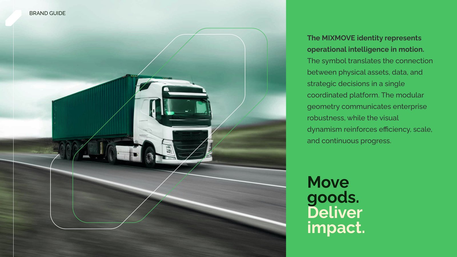
MIXMOVE is a logistics orchestration platform: it connects physical operations, data and decisions across hubs, fleets and partners in real time. The brand already had a logo, but it needed a system to speak to operations and supply chain directors on every channel.
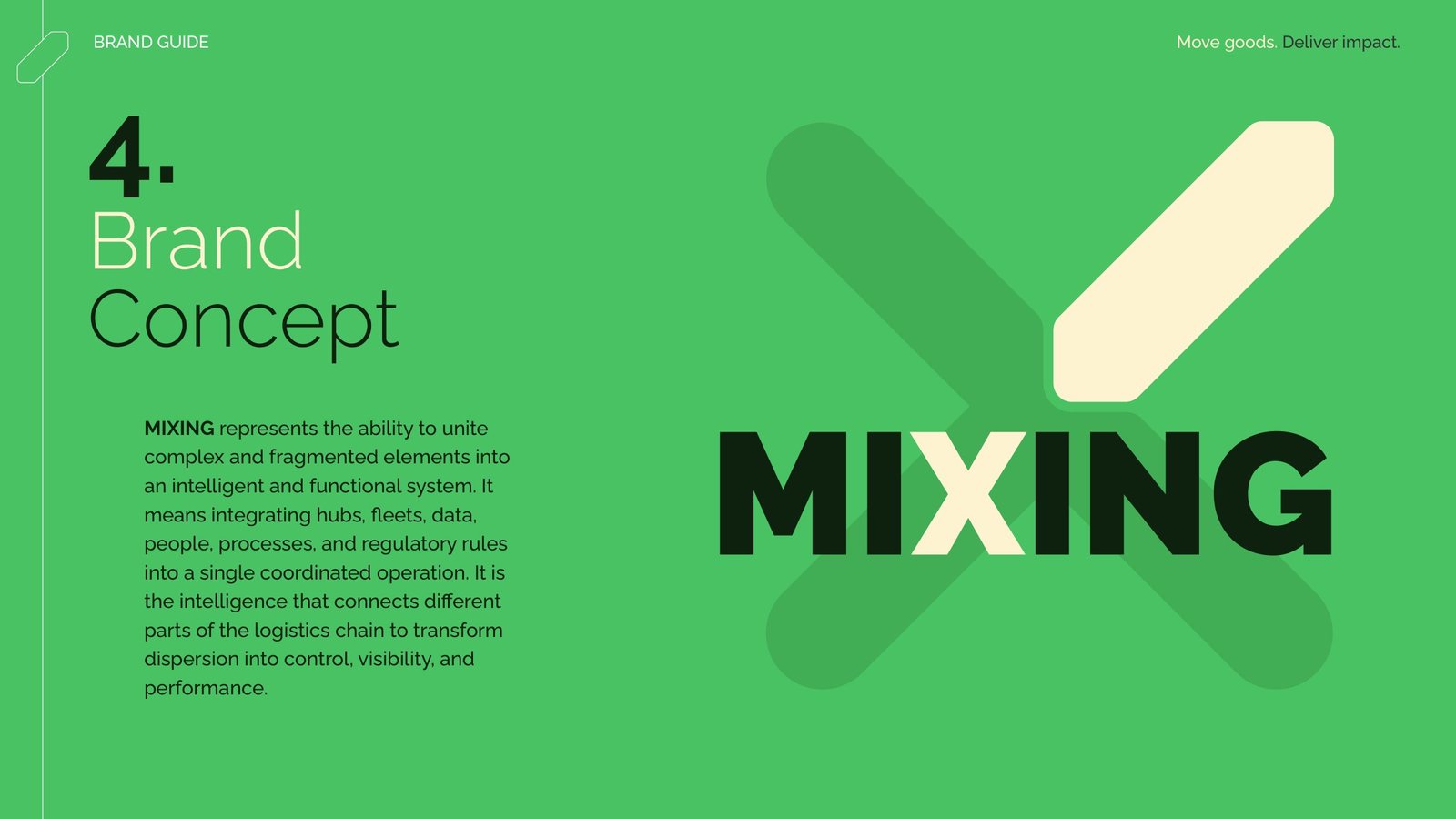
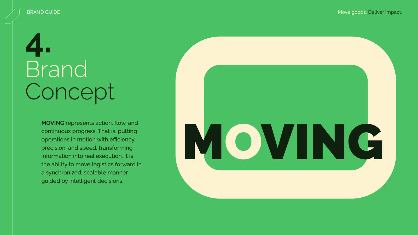
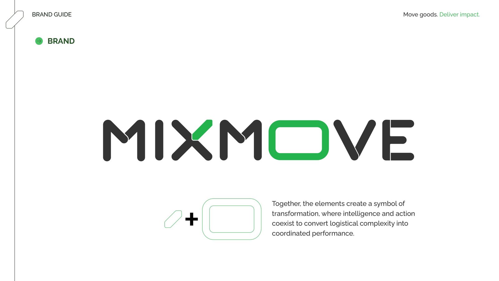
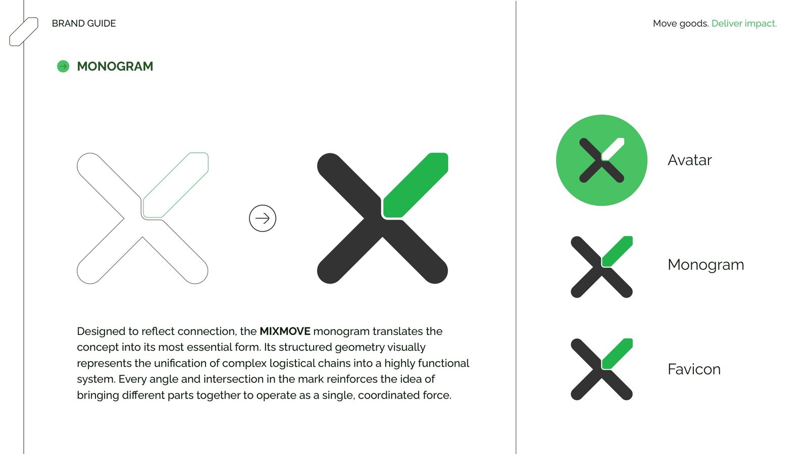
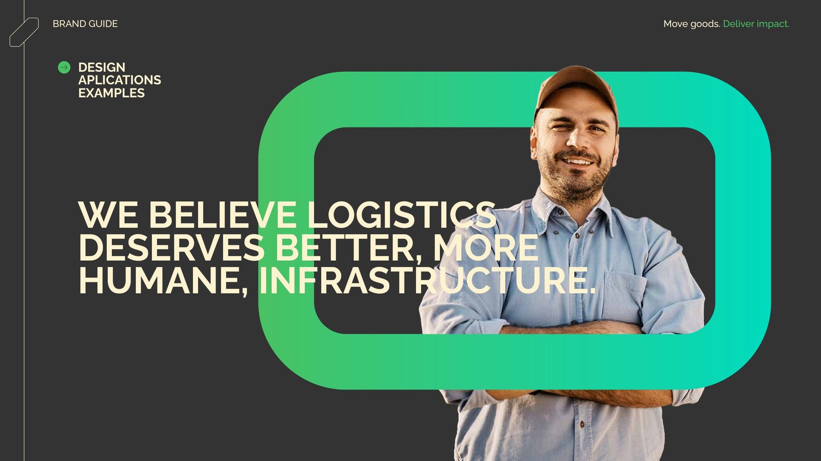
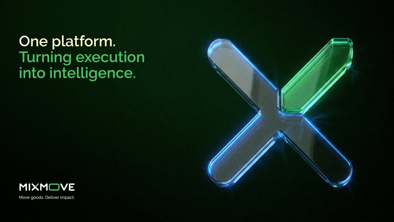
For MIXMOVE we created version 2 of the visual identity and the complete brand guidelines. The starting point was the logo itself: the X became Mixing, which brings the fragmented parts of the chain together, and the O became Moving, which puts the operation in motion.
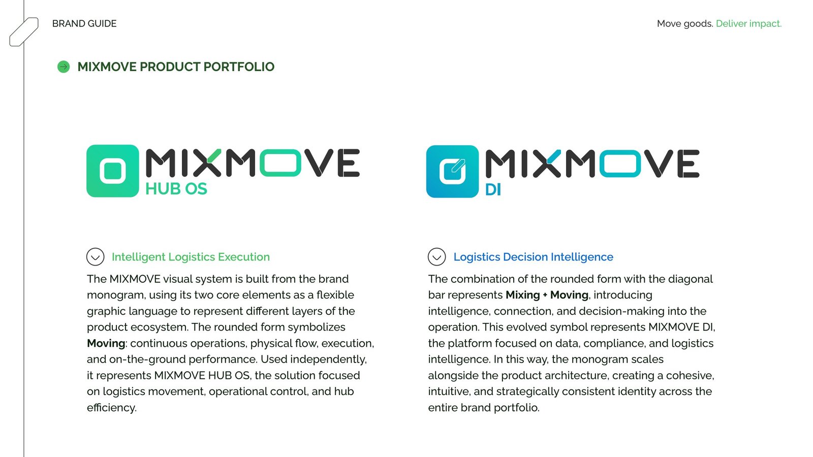
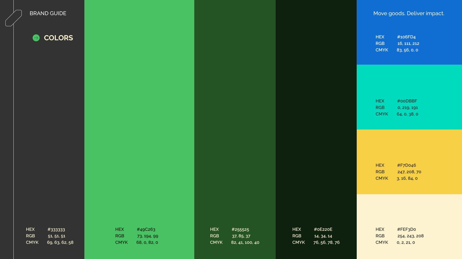
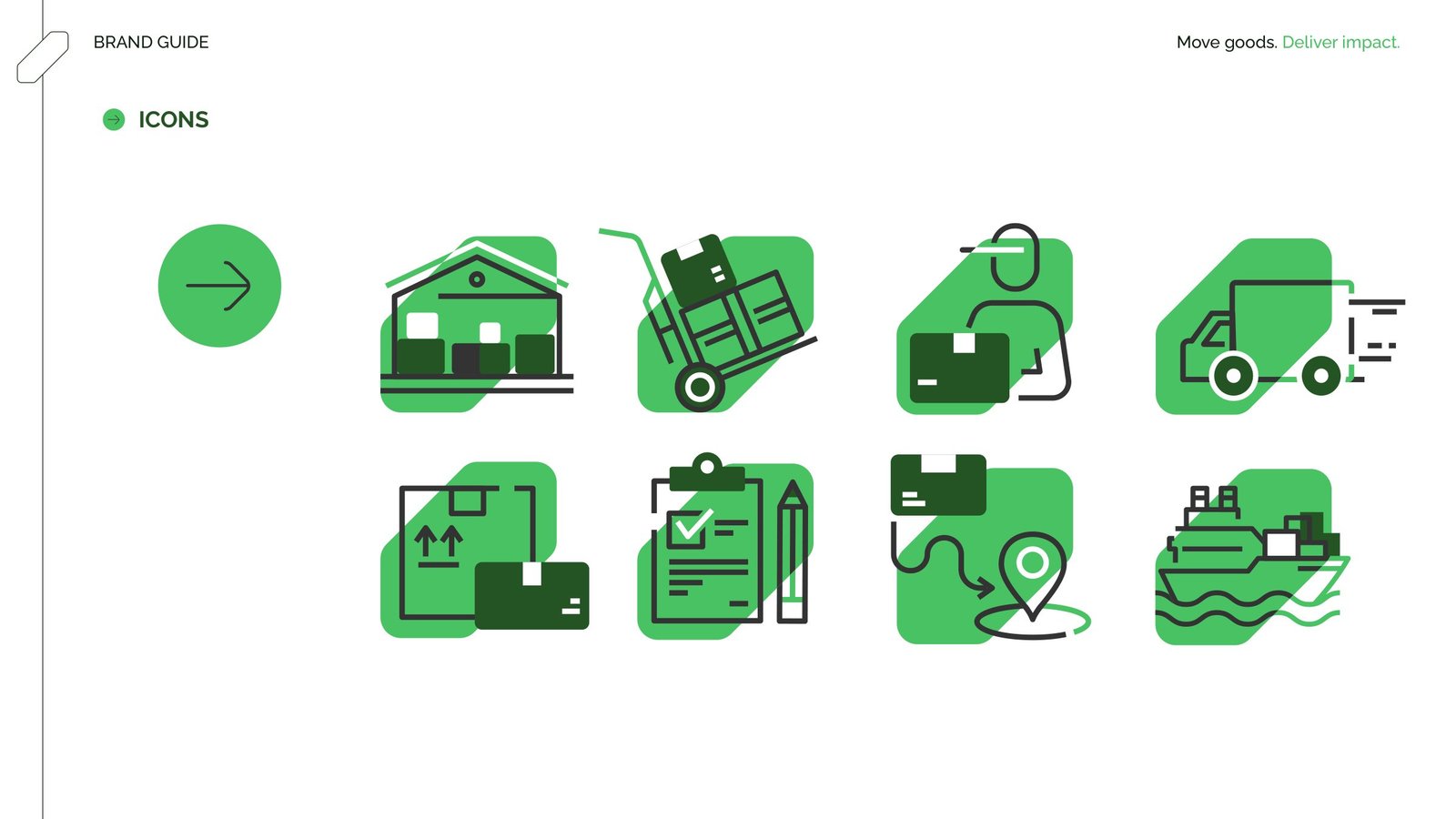
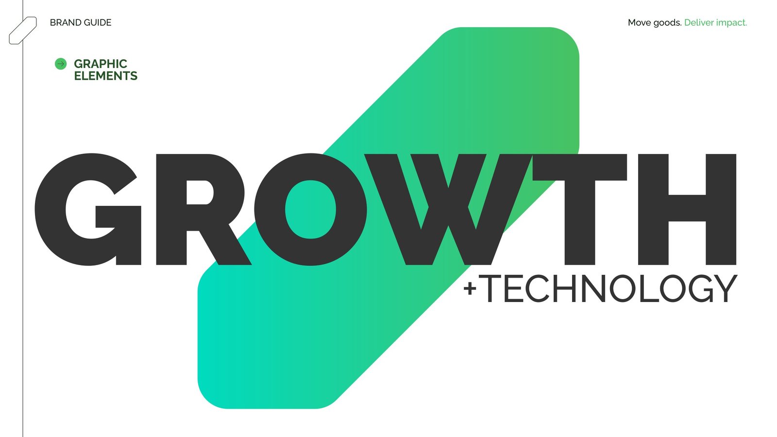
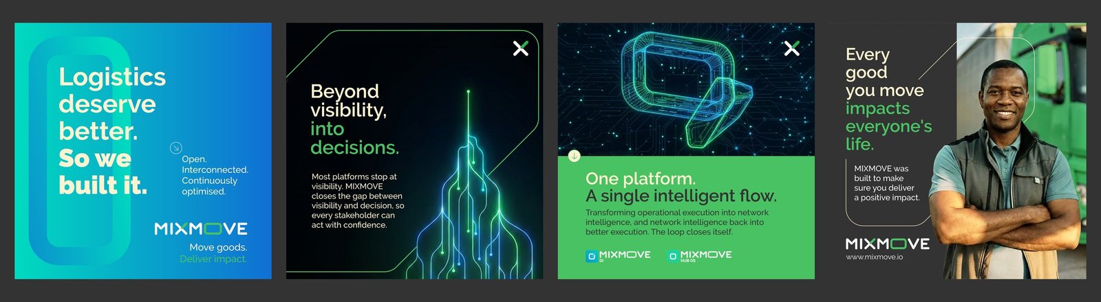
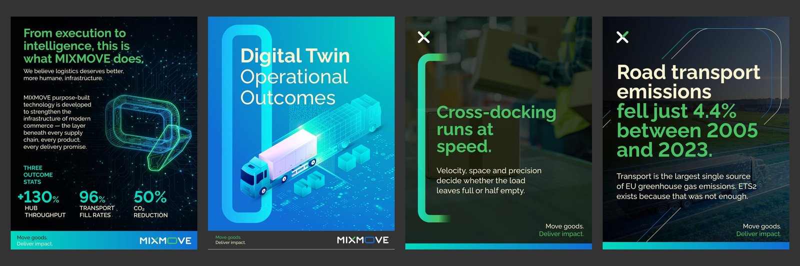
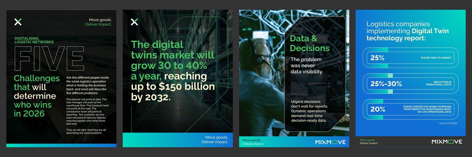
From these two elements came the monogram, the HUB OS and DI product marks, the graphic elements, icons and gradients, with the brand green alongside graphite, cream, turquoise, blue and yellow, and Raleway as the typeface. The line Move goods. Deliver impact. closes every piece.
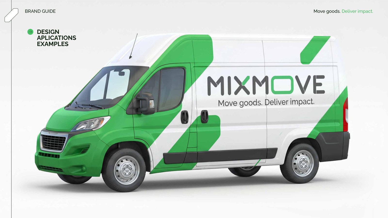
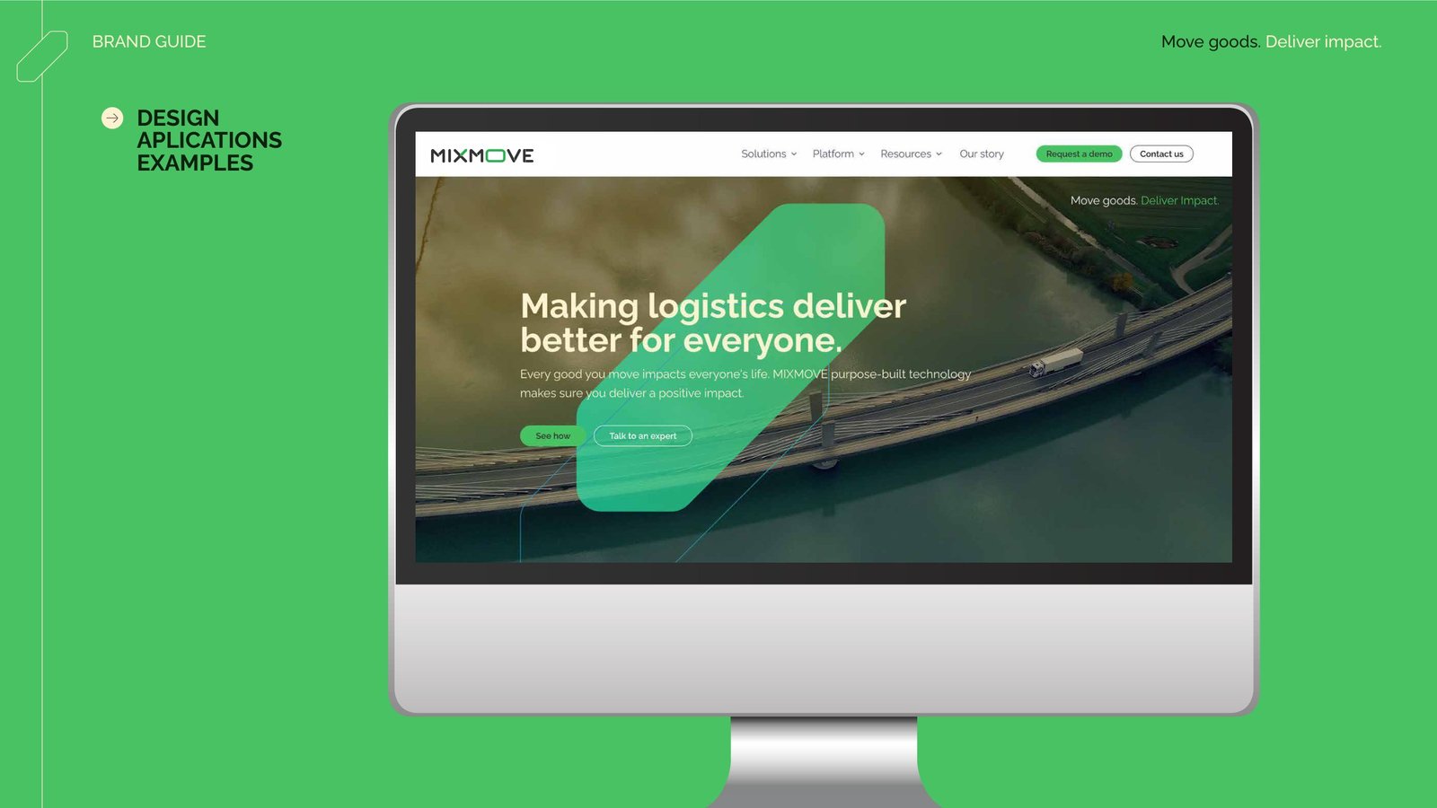
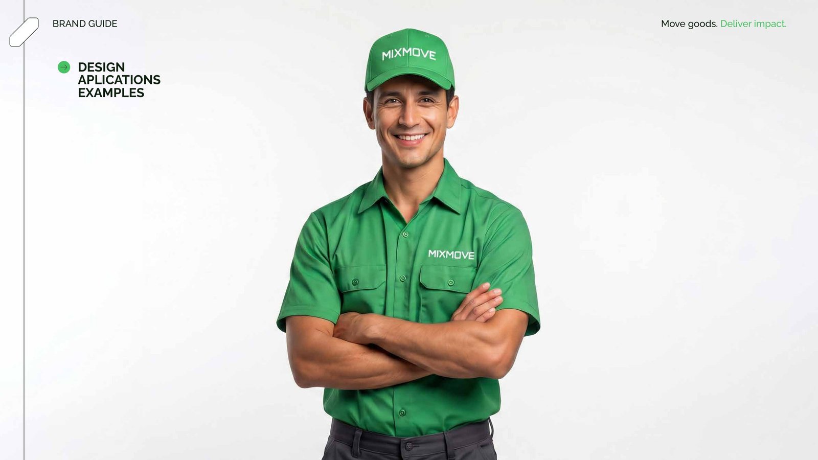
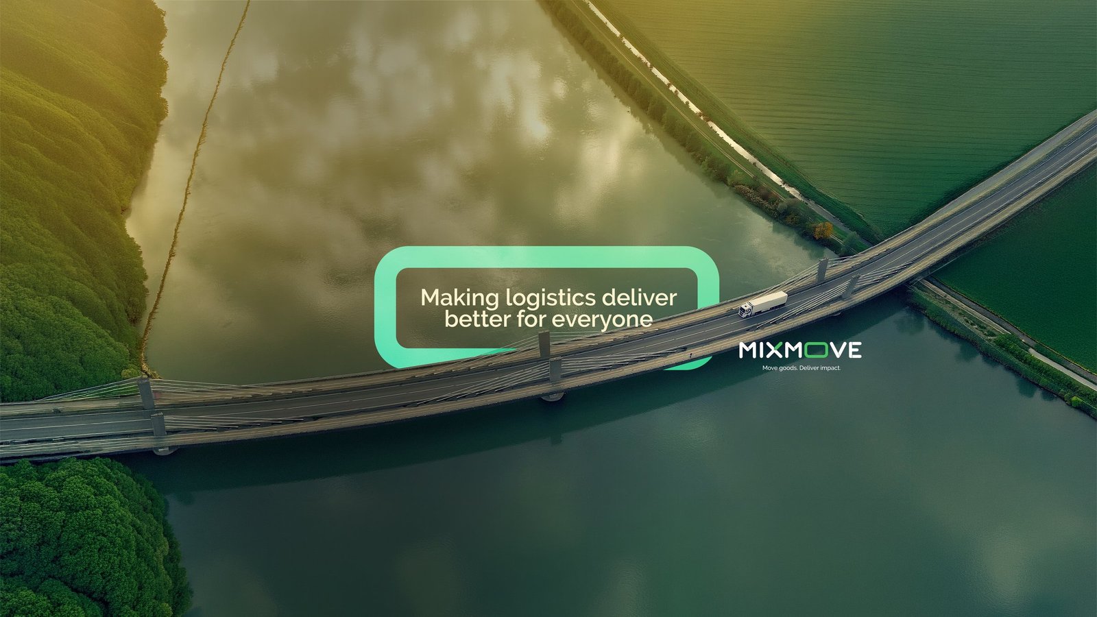
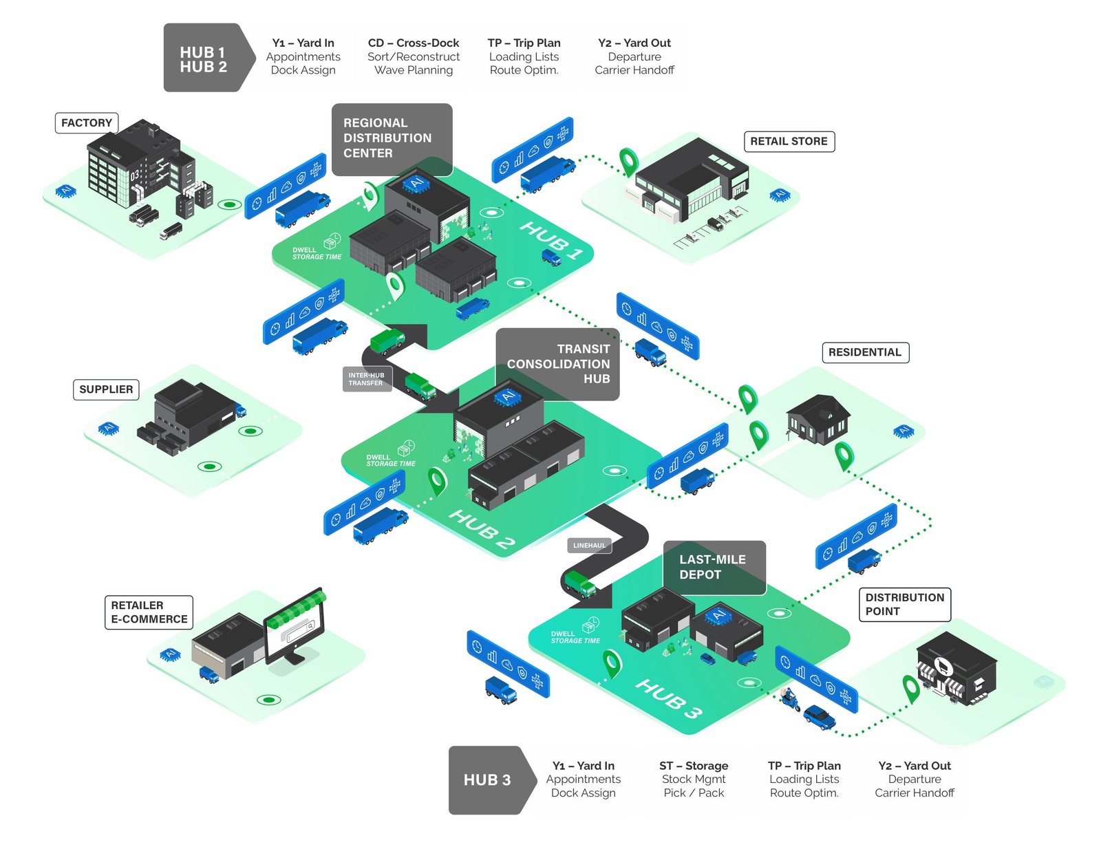
Deliverables: brand guidelines (version 2), brand concept, monogram, product marks, palette, typography, icons, graphic elements, application examples, LinkedIn and YouTube covers, meeting backgrounds, email signature, logistics network illustration, logo and illustration animation, and a series of LinkedIn posts.